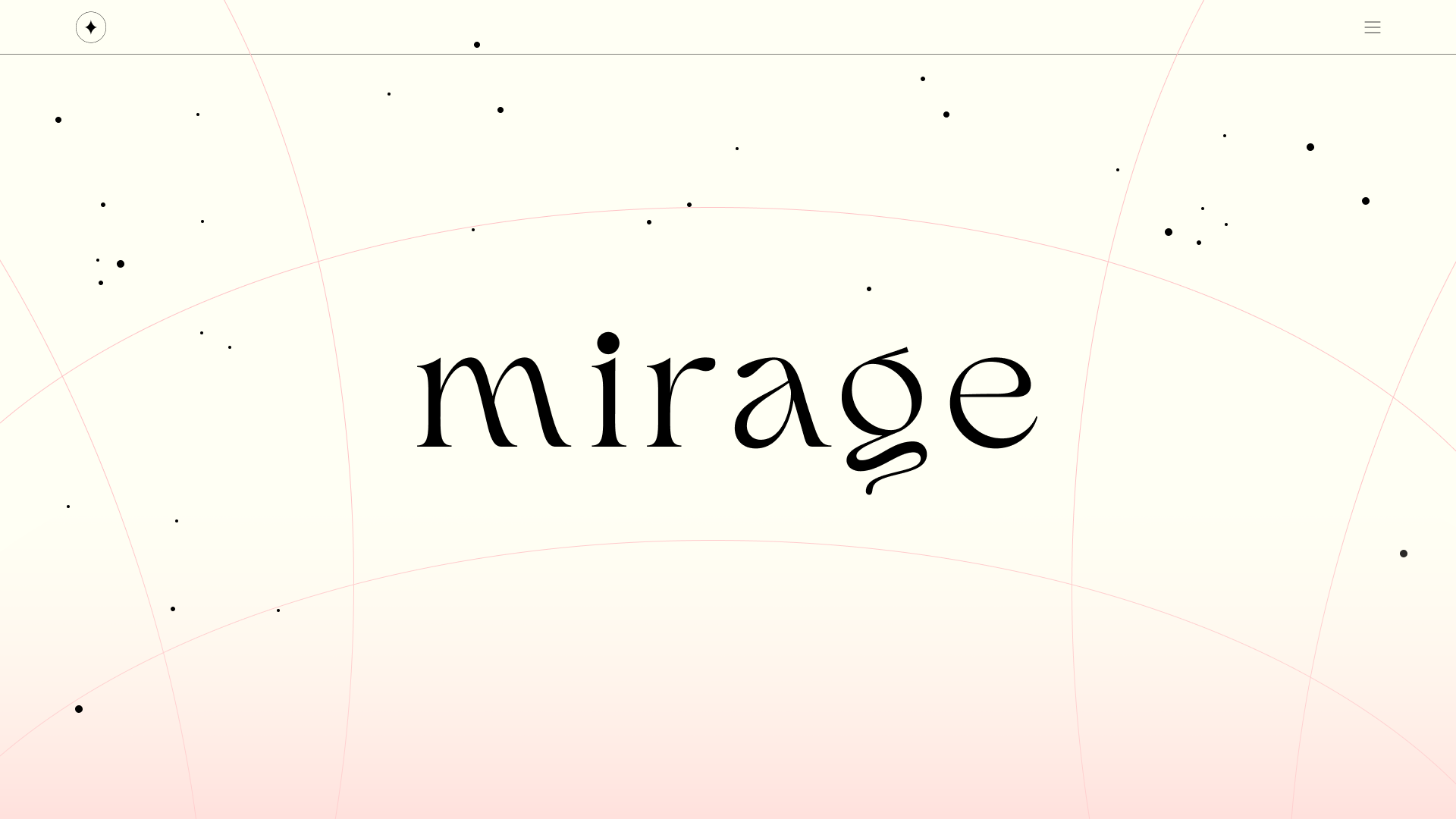
MIrage
Mirage is an AR/Web experience that takes the user on an interactive journey of the most precious memories of the past four years I've lived in Savannah. It offers a new way to navigate and relive these memories and experiences.
The experience allows users to step into the narrative within their personal timeline as active spectators.
Role:
Branding, UX/UI, Design Systems, Graphic Design, Creative Direction
Tools:
Figma, Spark AR, Adobe Aero, Photoshop

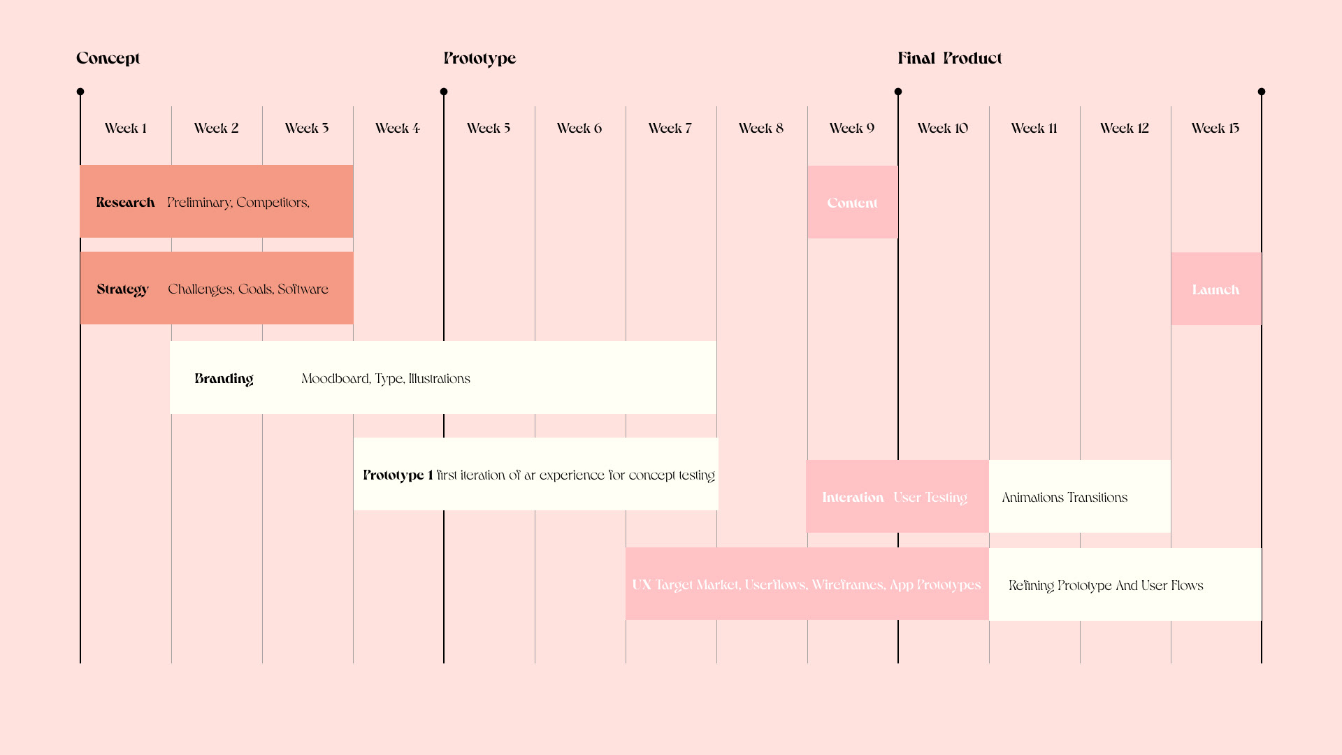
The design process
I structured the project with a detailed 13-week timeline to ensure I stayed on track with the tasks and met the tight deadlines I had established for myself.
Why Web & AR?
Video, photography, and social media are the most common means of sharing stories. However, their overwhelming accessibility bombards us with vast amounts of content that vie for our attention daily, often rendering much of it meaningless and forgettable.
Proof of concept
Before diving deep into the project, I created a prototype of the web and AR interactions. This allowed me to test my abilities with coding and AR, as well as evaluate the software I would use to develop the rest of the project.
Prototype in Swift playgrounds
Prototype in AR
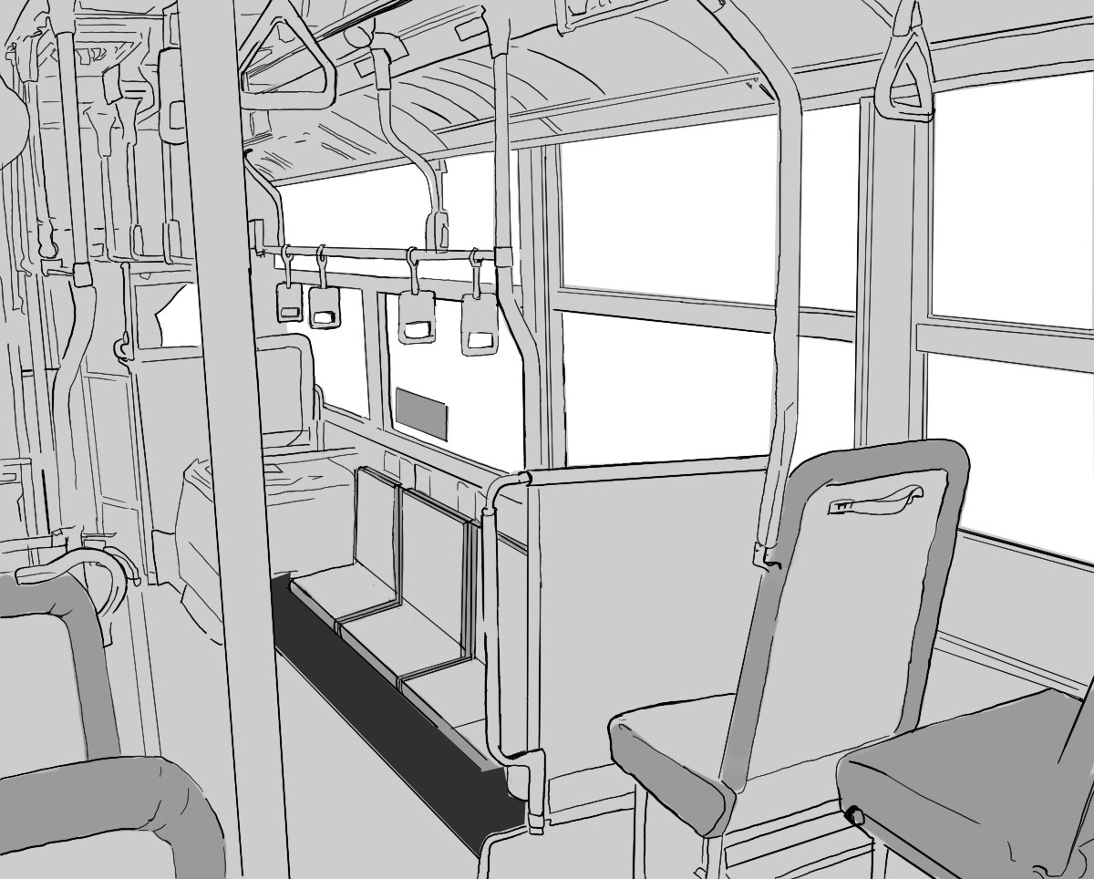
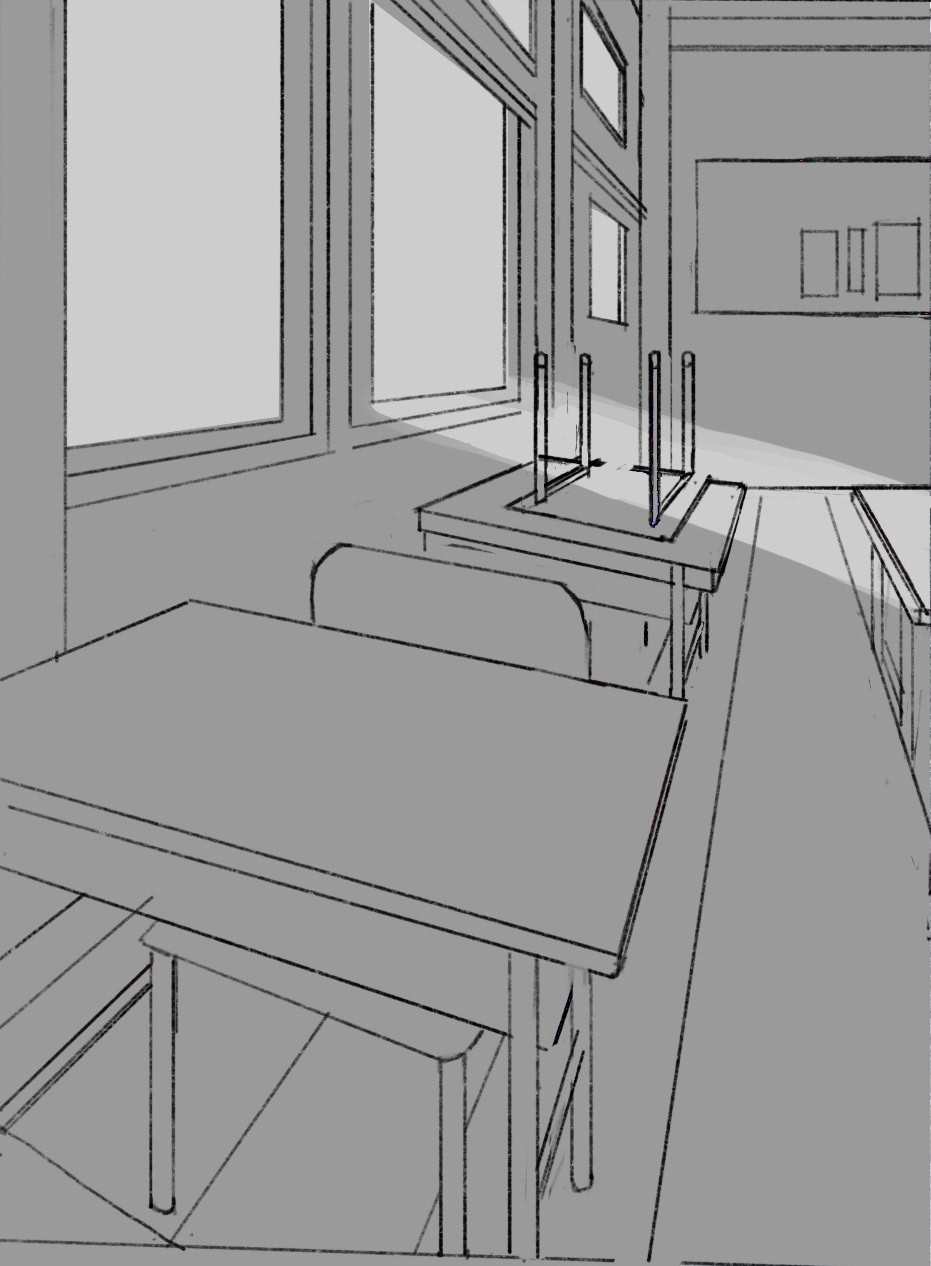
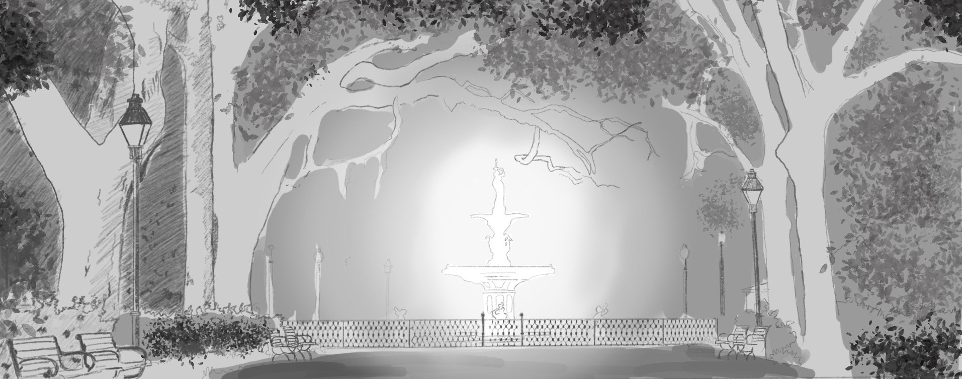
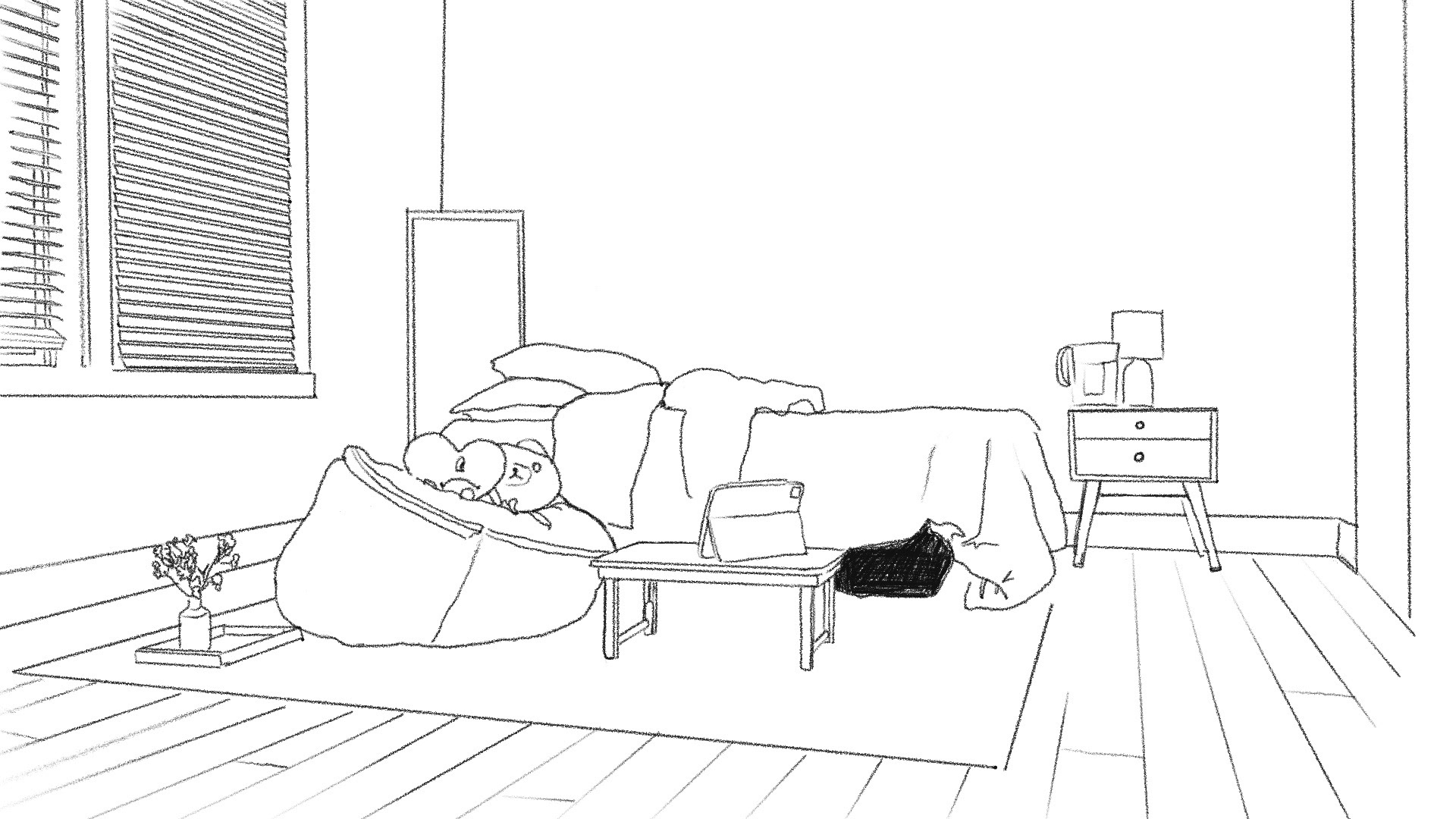
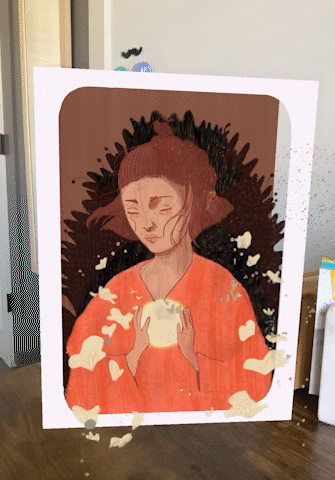
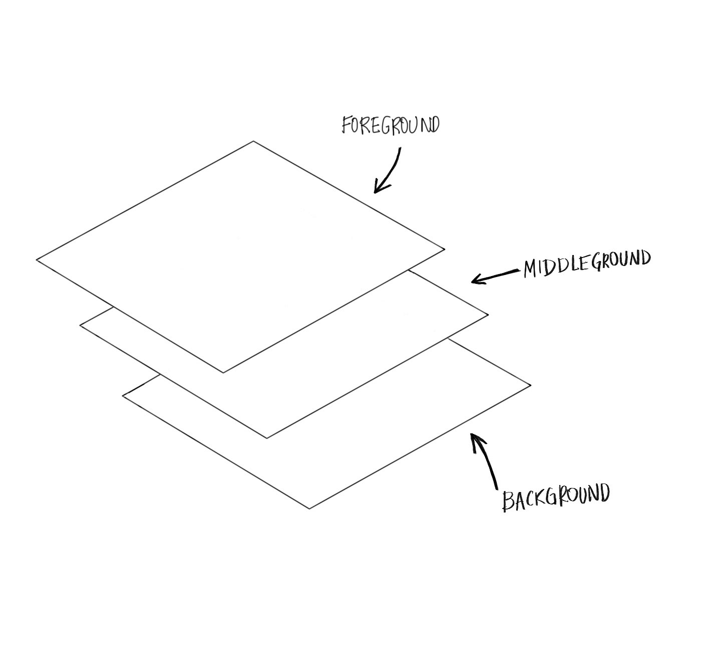
Breakdown
The illustrations were separated into different layers. To mimic how things were going to be arranged in AR. This separation created a sense of depth when the user viewed the illustration.
One challenge of using 2D assets in AR is that it limits the range of motion for tilting or walking around the layered space, which can break the immersive illusion. A great solution for this is to use a frame in front of the picture plane, providing users with more range of motion and better separation between the assets.
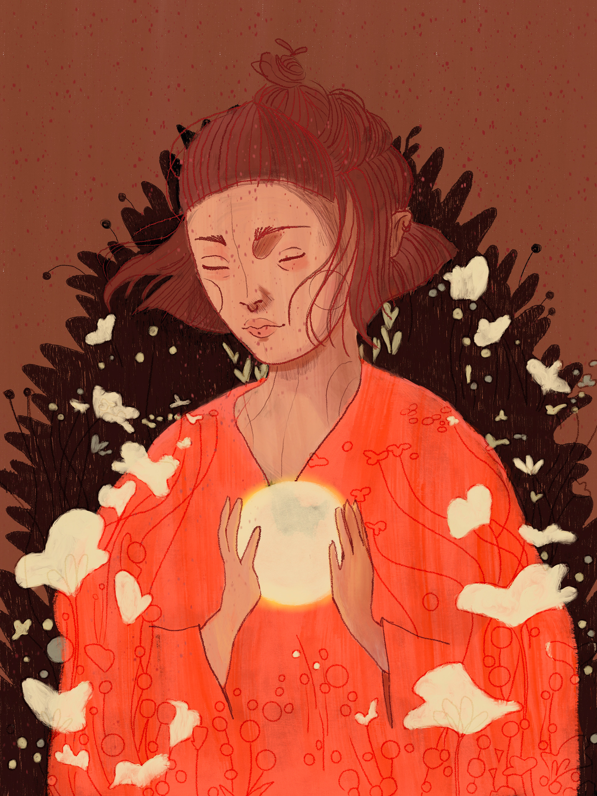
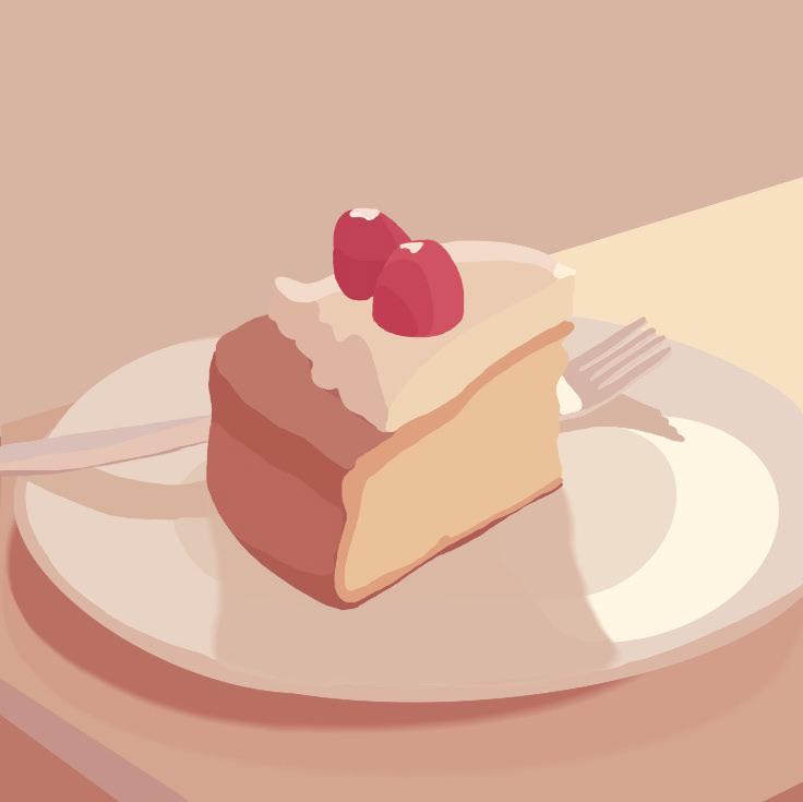
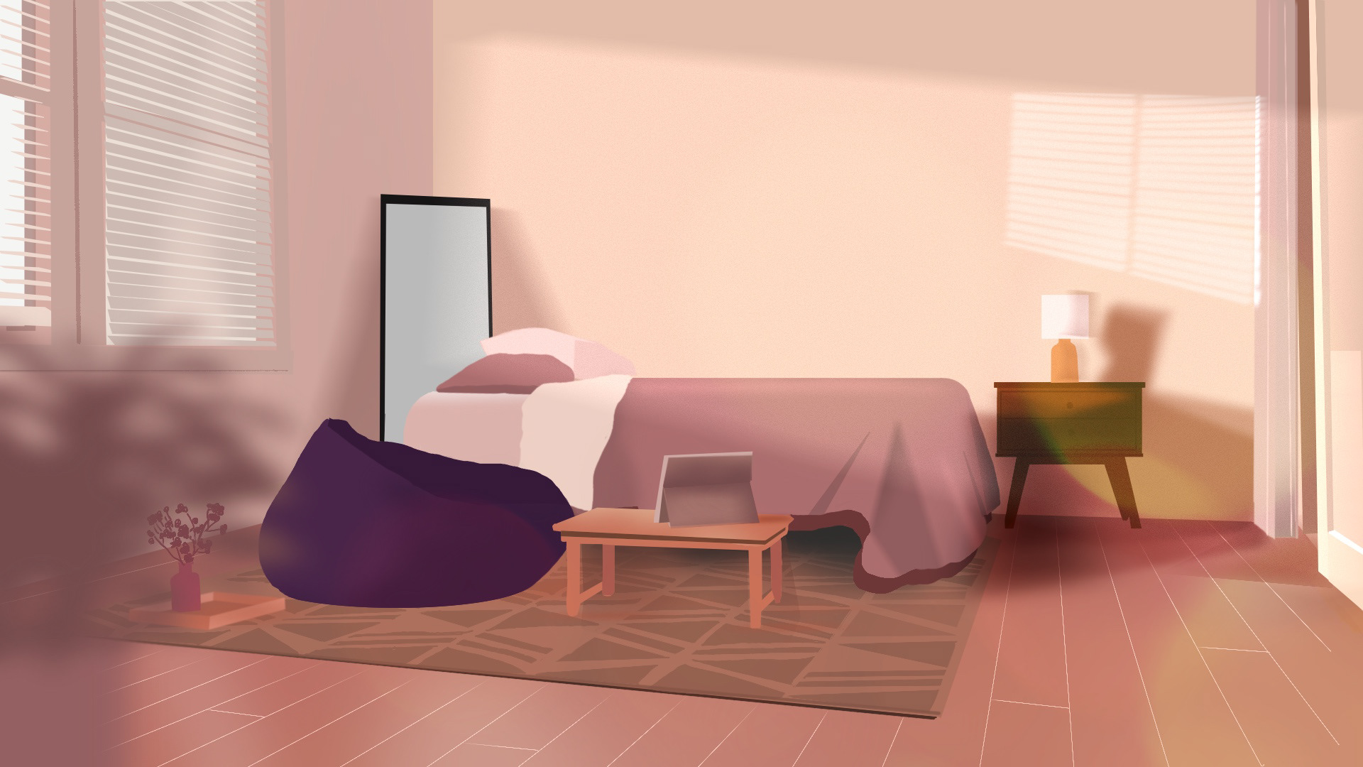
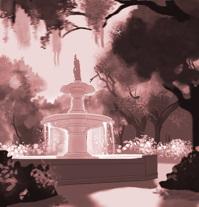
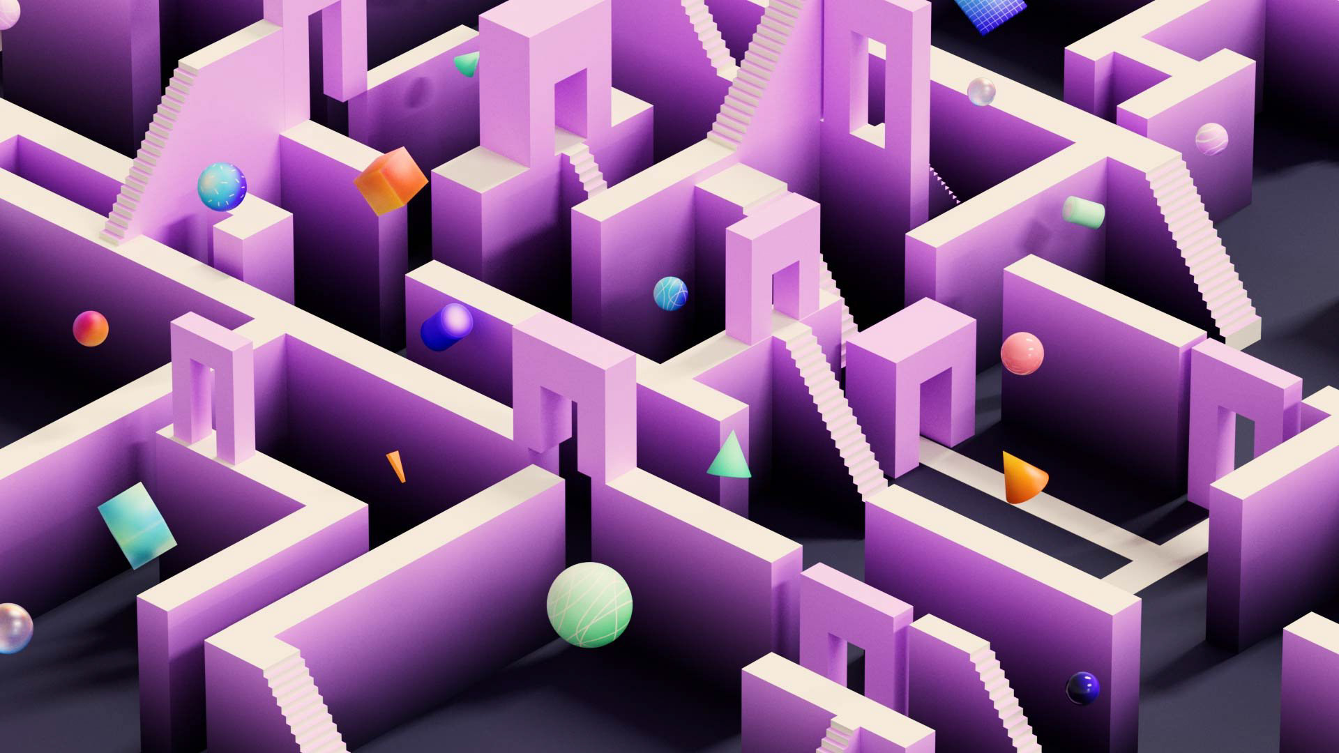
Final Illustration
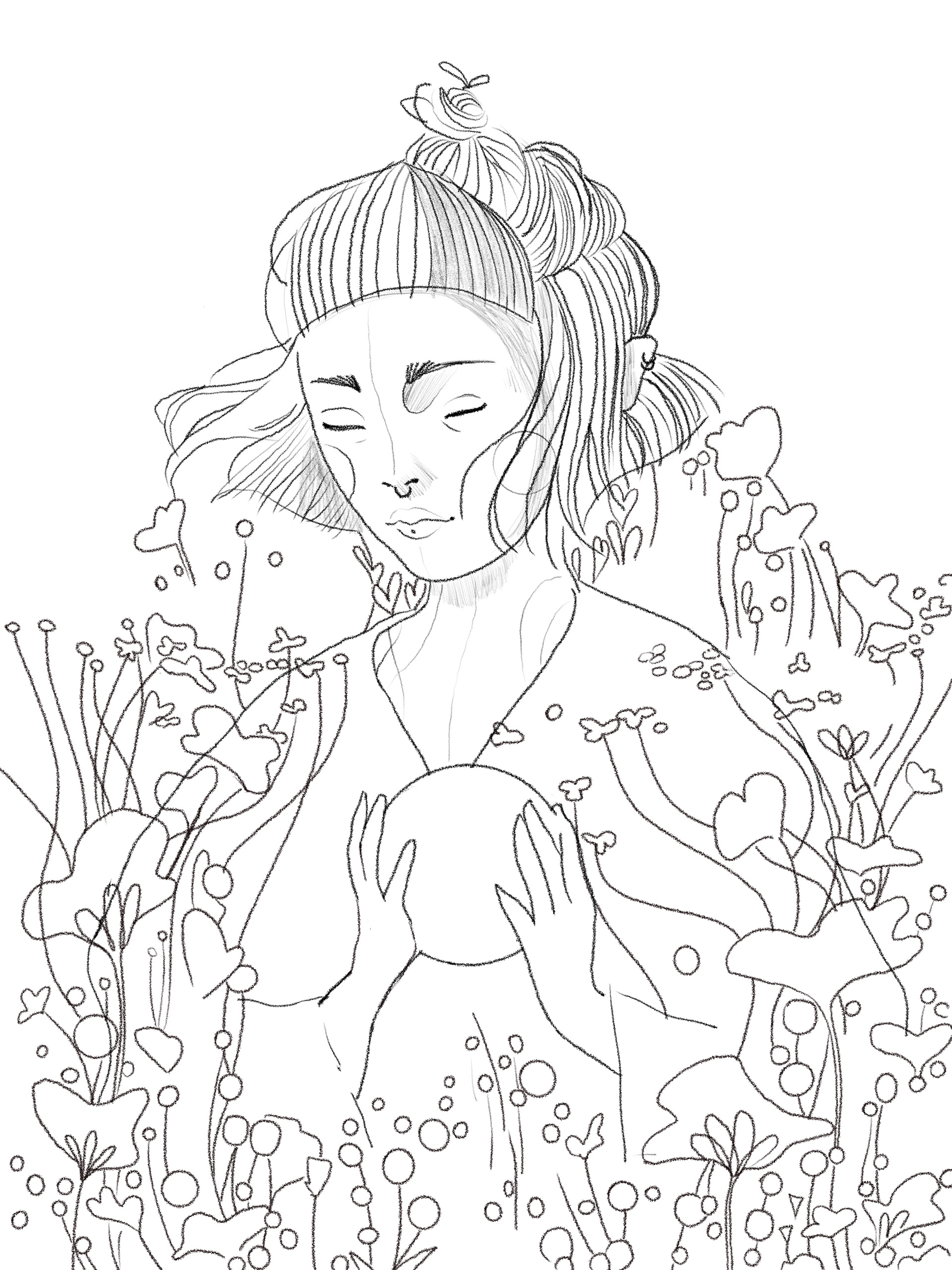
Sketch
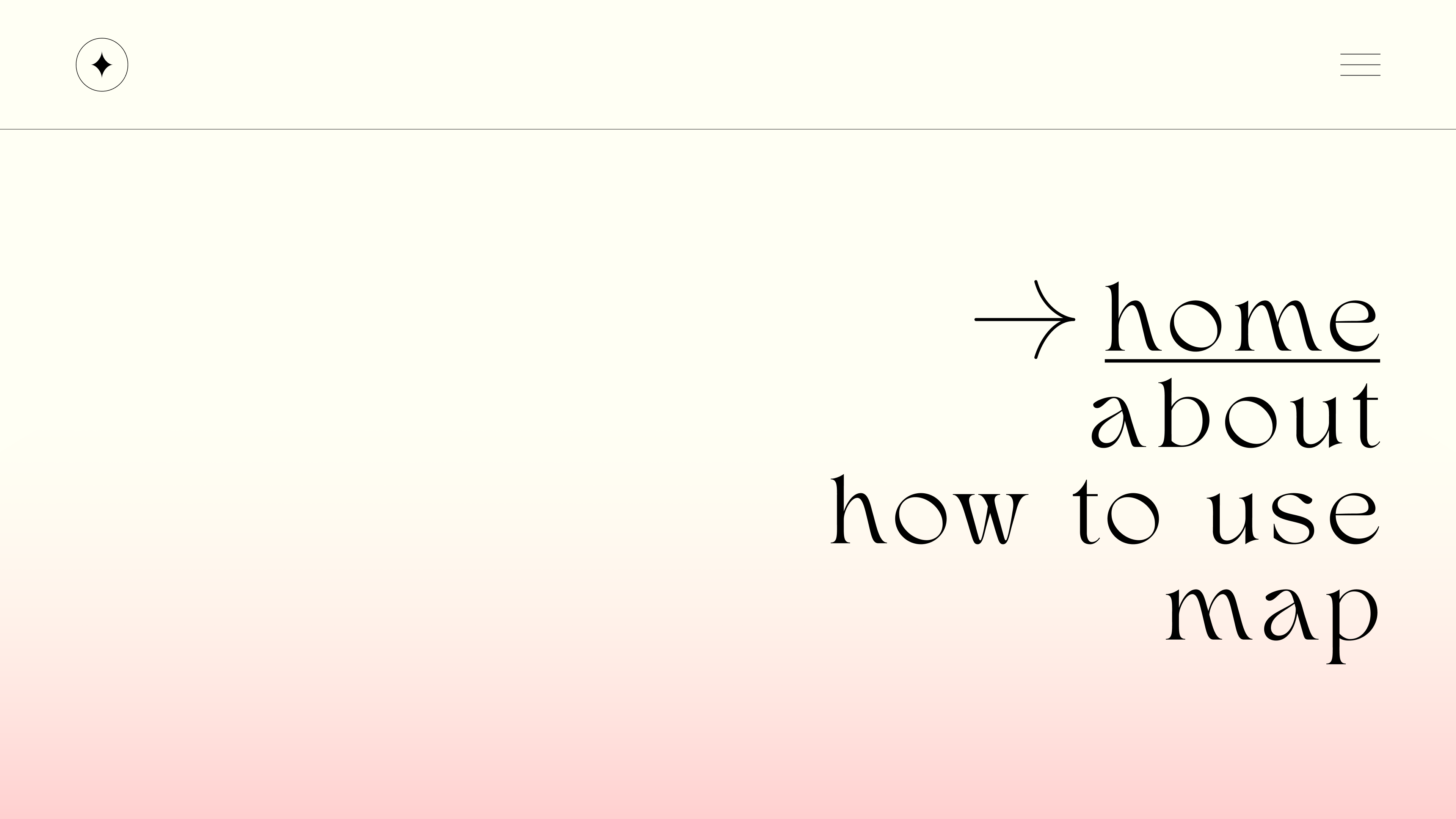
UX/UI
Designing the interface for the web app was one of my favorite parts of this project. I utilized Figma to create user flows, wireframes, mock-ups, and high-fidelity prototypes.
The page flow is a continuous scroll through the initial concept and formation of the mirage. Then, the user proceeds to the web or interactive portions of the site.
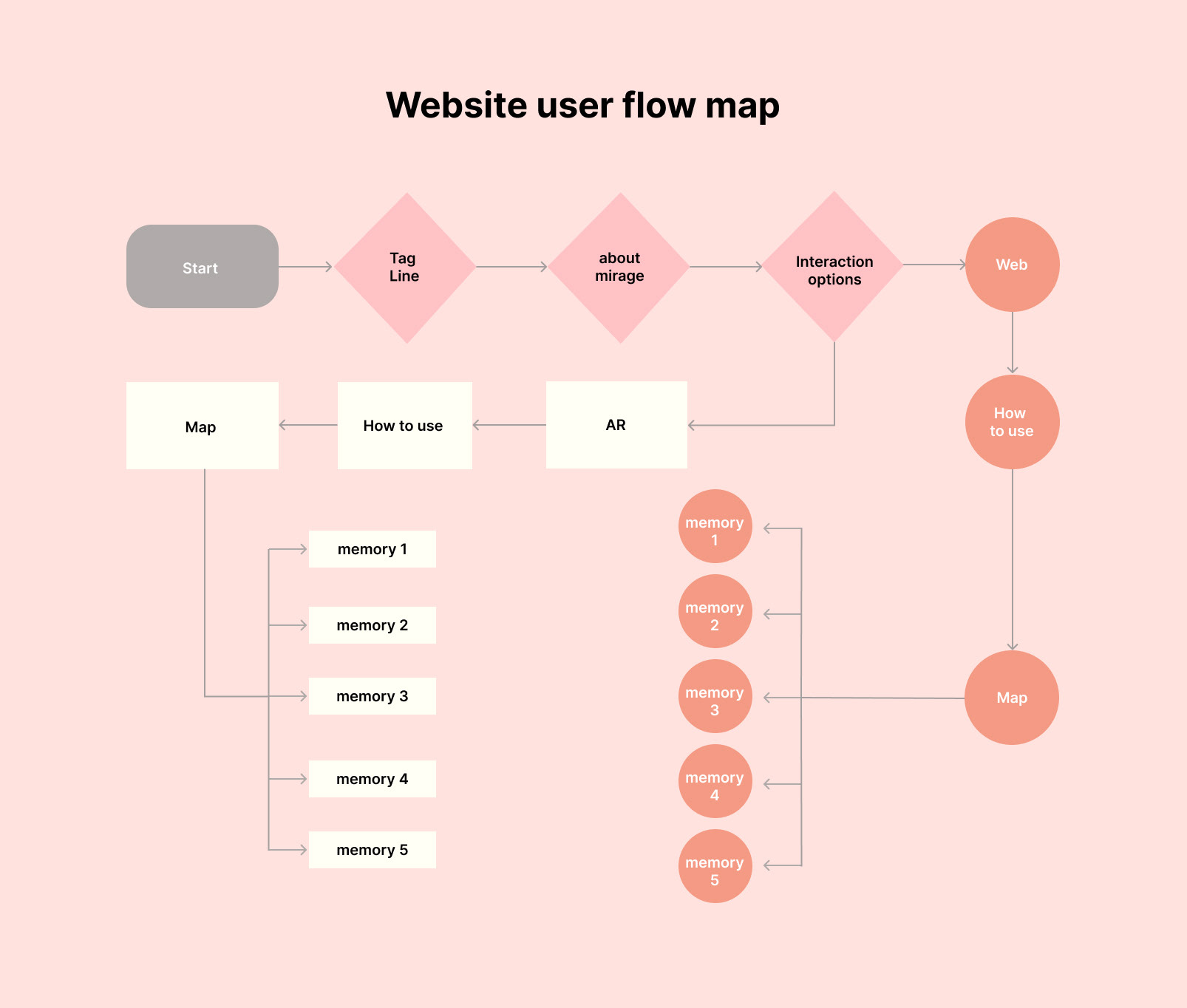
Wireframes and page flow
Setting up lo-fi wireframes before filling in content to test the most effective flow for the user was essential to keep the clicks to the minimum and increase engagement to the maximum.
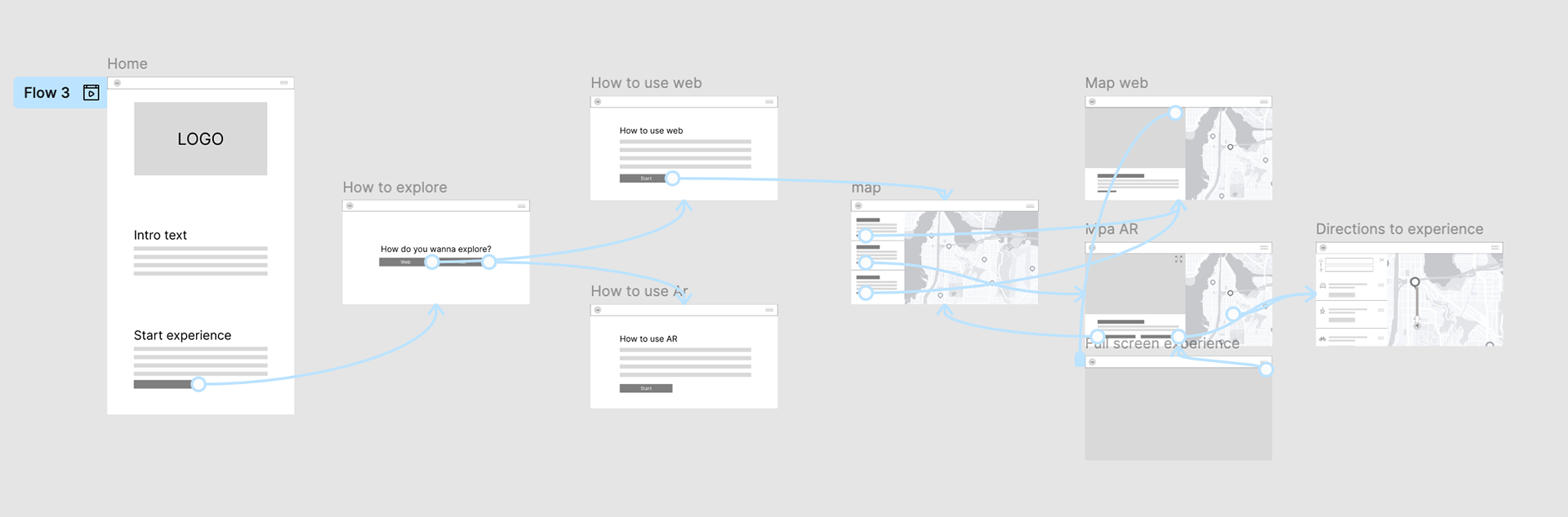
After testing the Lofi prototype, I created Hifi prototypes to test the breakpoints and scalability for mobile and web apps.
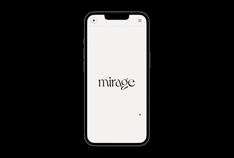
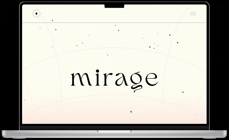
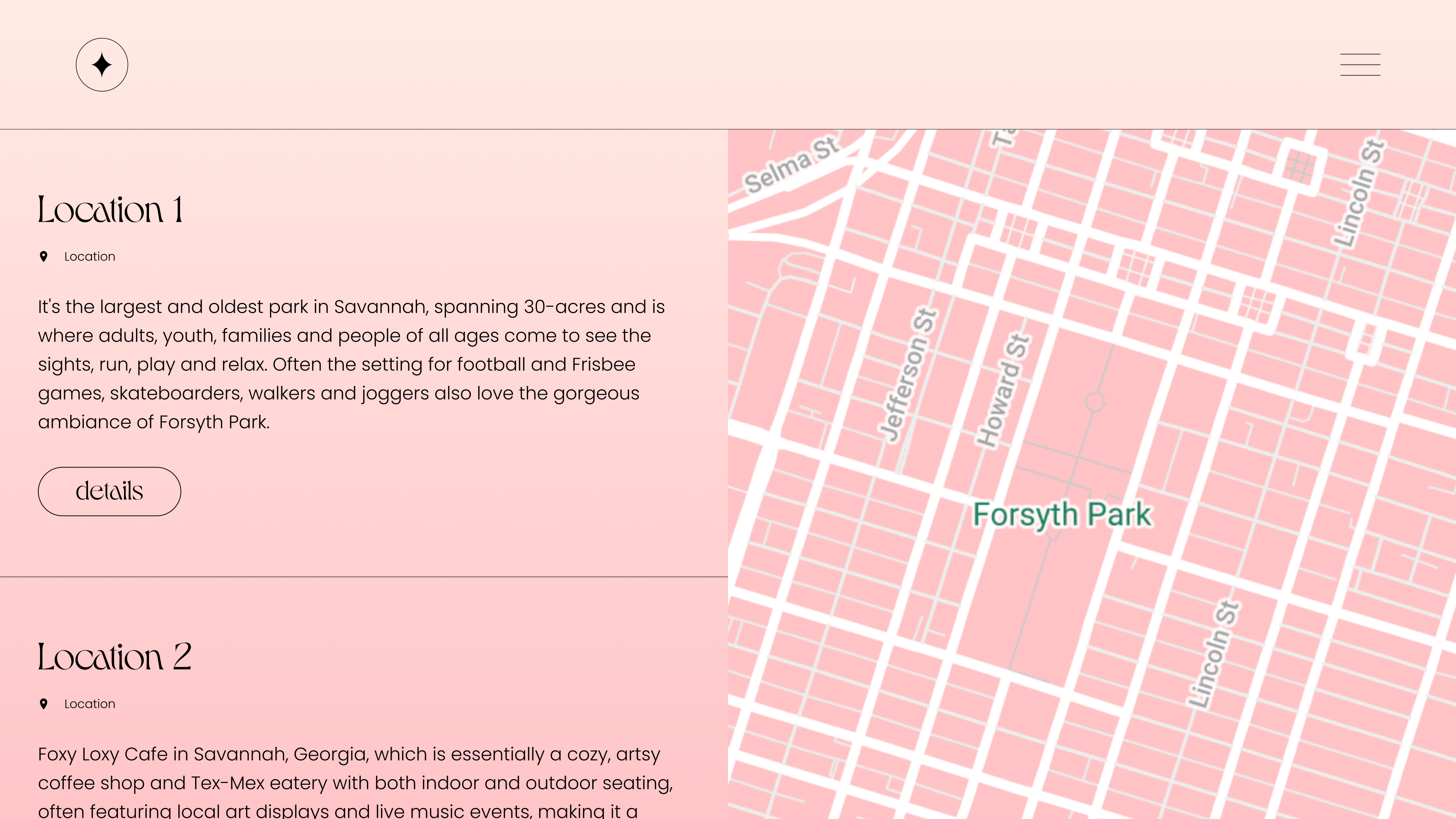
Design of the pages
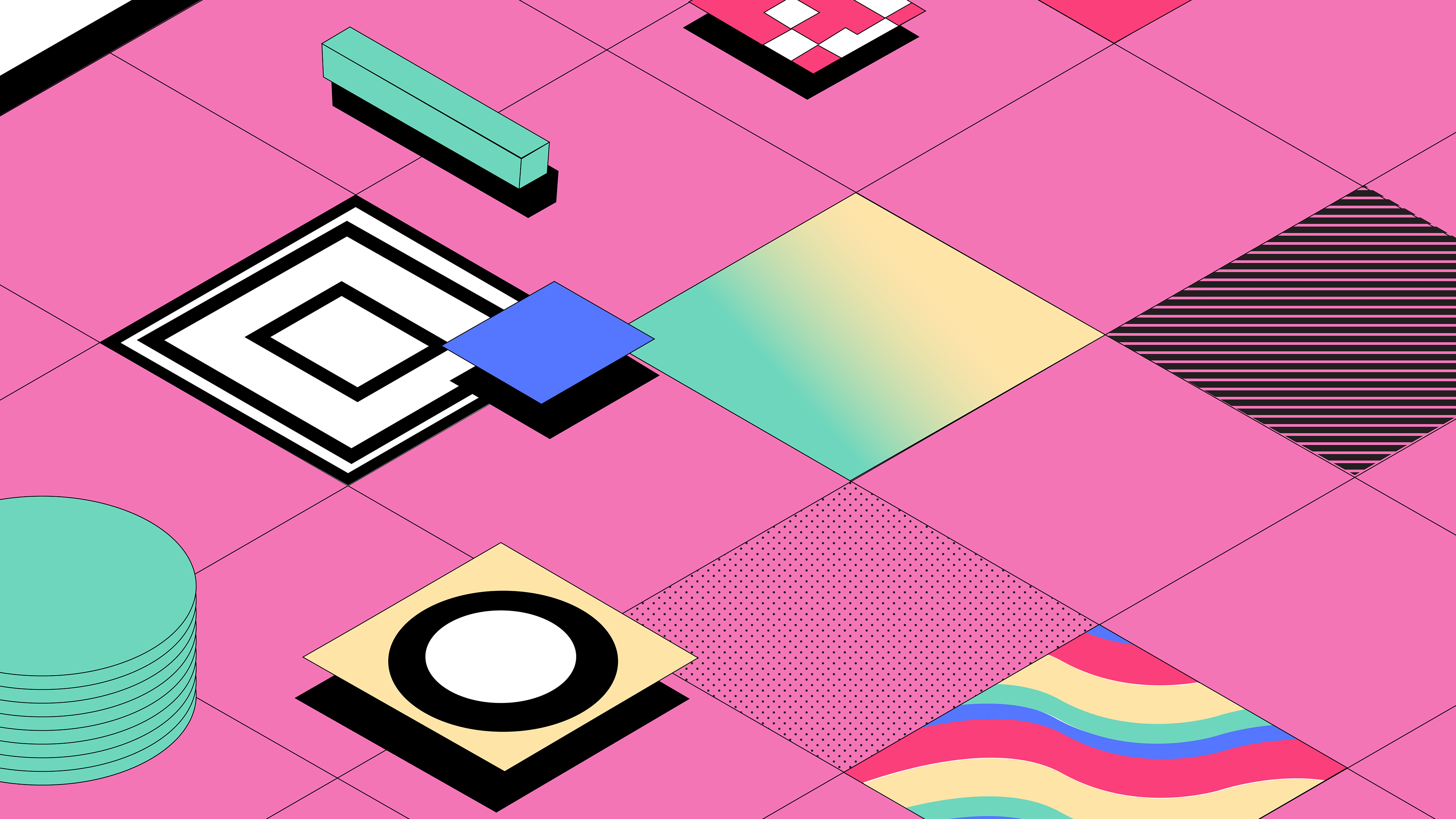
The color palette conveys the concept of seeing life through rose-colored glasses. These memories are the highlight of my college experience in Savannah. The pink and cream colors signify warmth, serenity, and love. Meanwhile, the gradients and hazy blurs invoke nostalgia and nudge an ephemeral memory.


Map design
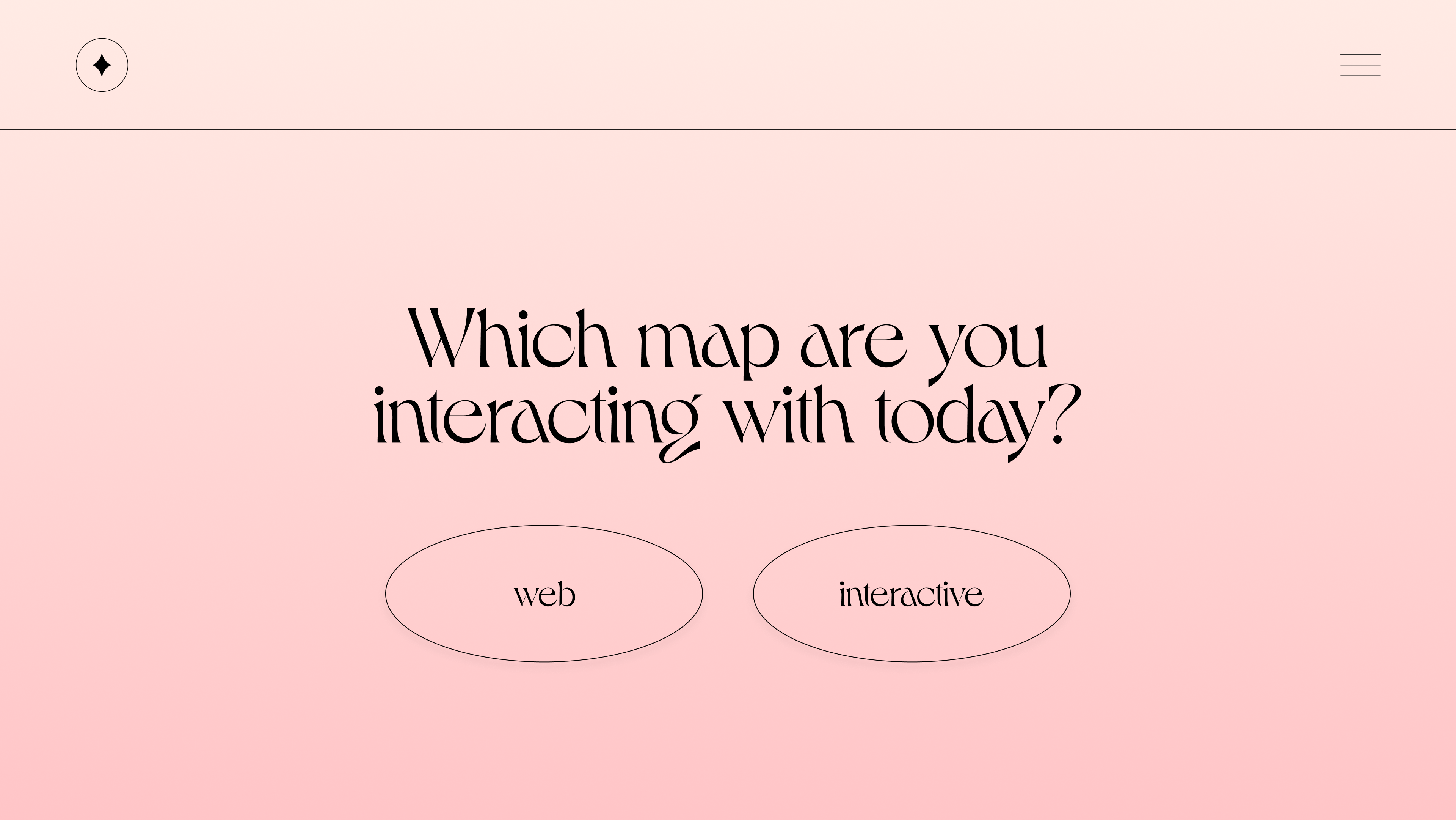
The web experience map is a simplified version of the Savannah map. This design decision reduces the distractions and encourages the user to focus on the points of the experience and where they are located. That illustrated map is exclusive to the web app since it does not rely on Geolocation to reveal the pins when nearby.
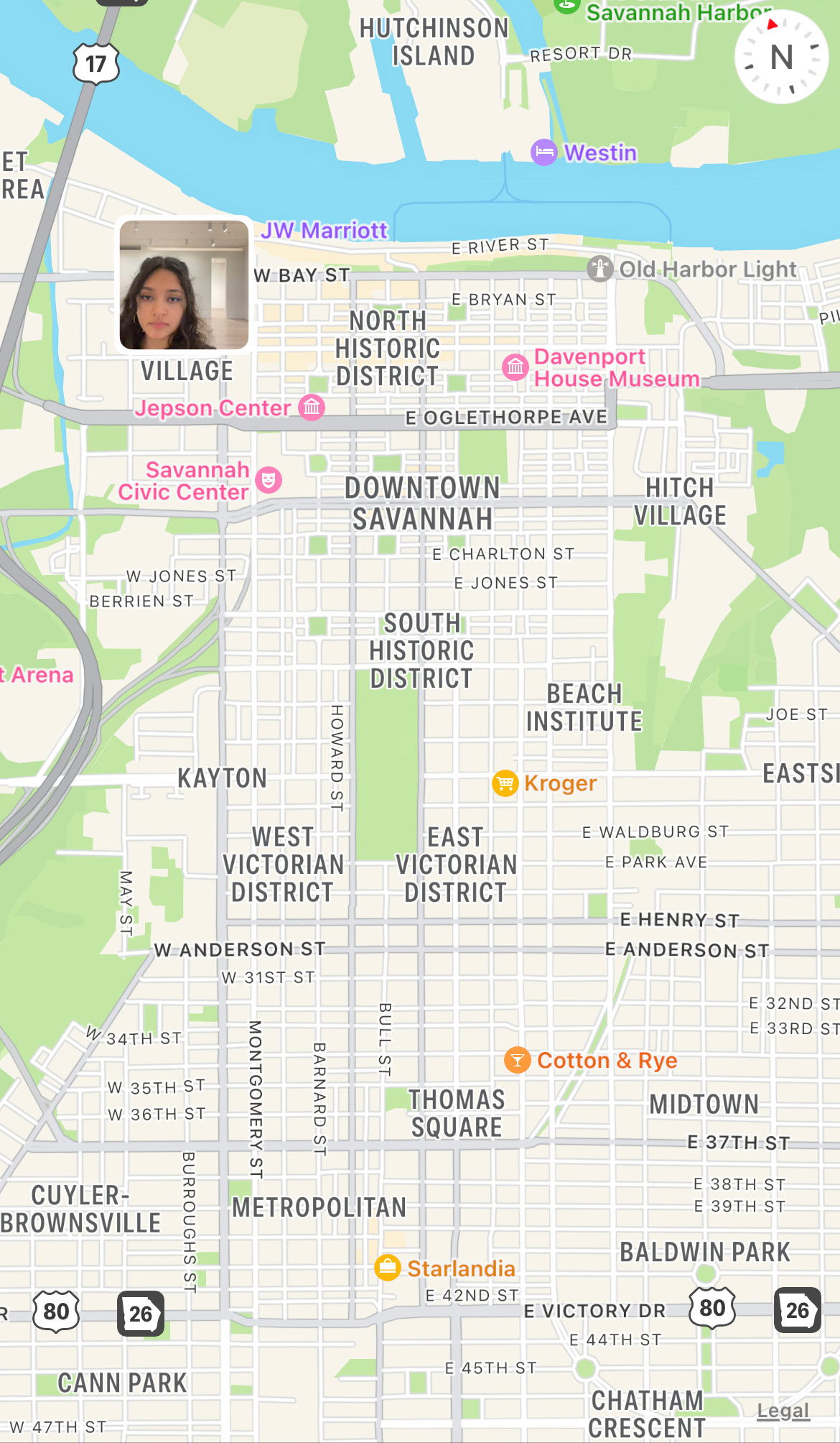
The interactive portion uses a customized map that matches the color and branding of the project. This allowed the user to get directions and not have them leave the app to continue with the interaction.
WEB DEVELOPMENT
For the technical portion of the project, I taught myself CSS and Javascript to make illustrations interactive on the web. Here is a snip of my code for the tilt interaction.
Illustrations
The illustrations are places where I had a fond memory or somewhere that was significant to me. I wanted them to capture the sense of depth and ephemerality to make the viewer notice the small details and invoke a sense of wonder.