HEXAGON
Hexagon AB is a multinational industrial technology company that creates measuring technology, geospatial tools, and software. It is the parent company of Leica Geosystems and Infor EAM, among other subsidiaries.
Client:
Hexagon AB
Role:
Branding, UX/UI, Design Systems, Graphic Design
Tools:
Figma, XD, Clarity, Photoshop
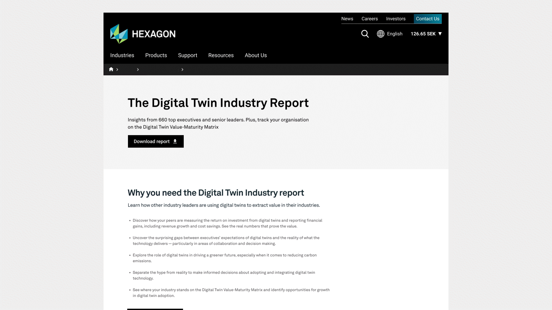
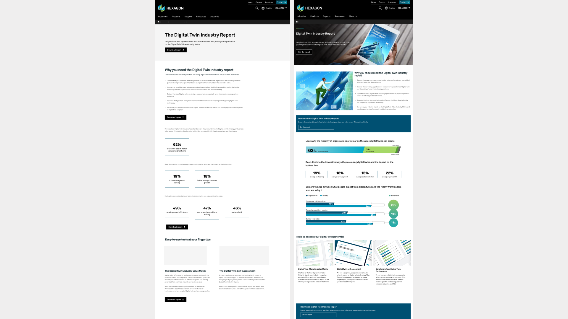
Digital Twin Report Page
Page for the insights from 660 top executives and senior leaders on digital twins.
The live page can be seen here:
Wireframes
I created a wireframe and high-fidelity mockup that served as a visual blueprint. The wireframe outlines the structure and functionality of the digital interface.
Hexagon LIVE Global 2025
Hexagon hosts an international conference showcasing its innovative technology and breakthroughs. This year, I was in charge of structuring the page flow and designing the landing and subpages for the conference.
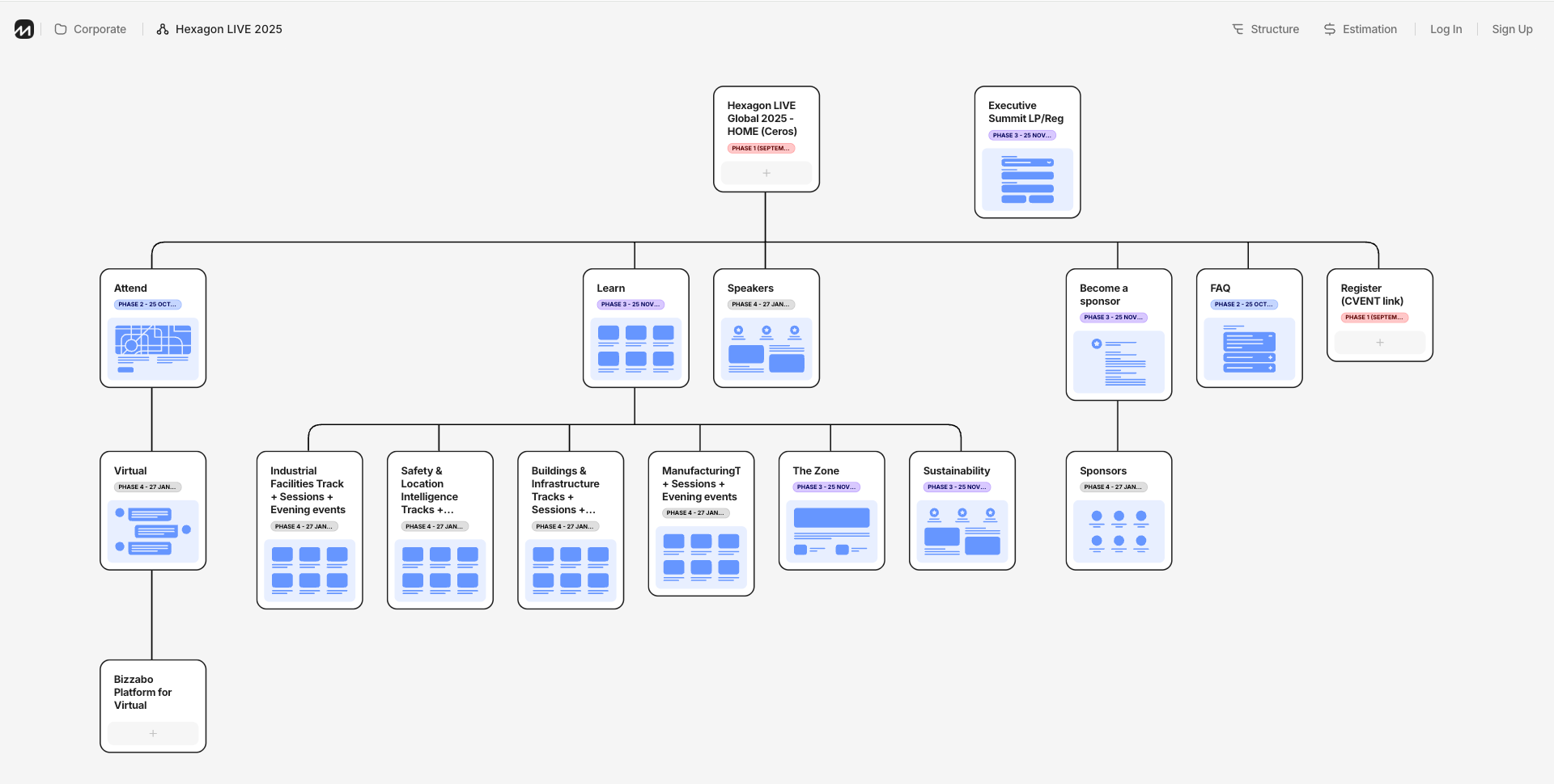
Page flow
The team and I began by creating the page flow site map and the timeline before the conference. Breaking down page navigation and how each page would redirect to other subpages.
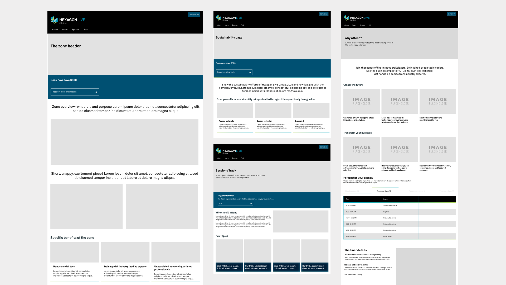
Wireframes
Once the timeline and flow were established, I created mock-ups for the subpages to define the information structure and to send to stakeholders for review.
Landing page
I also implemented the design for the conference landing page on a platform called CEROS.
you can find the live pages here: https://hexagonlive.com
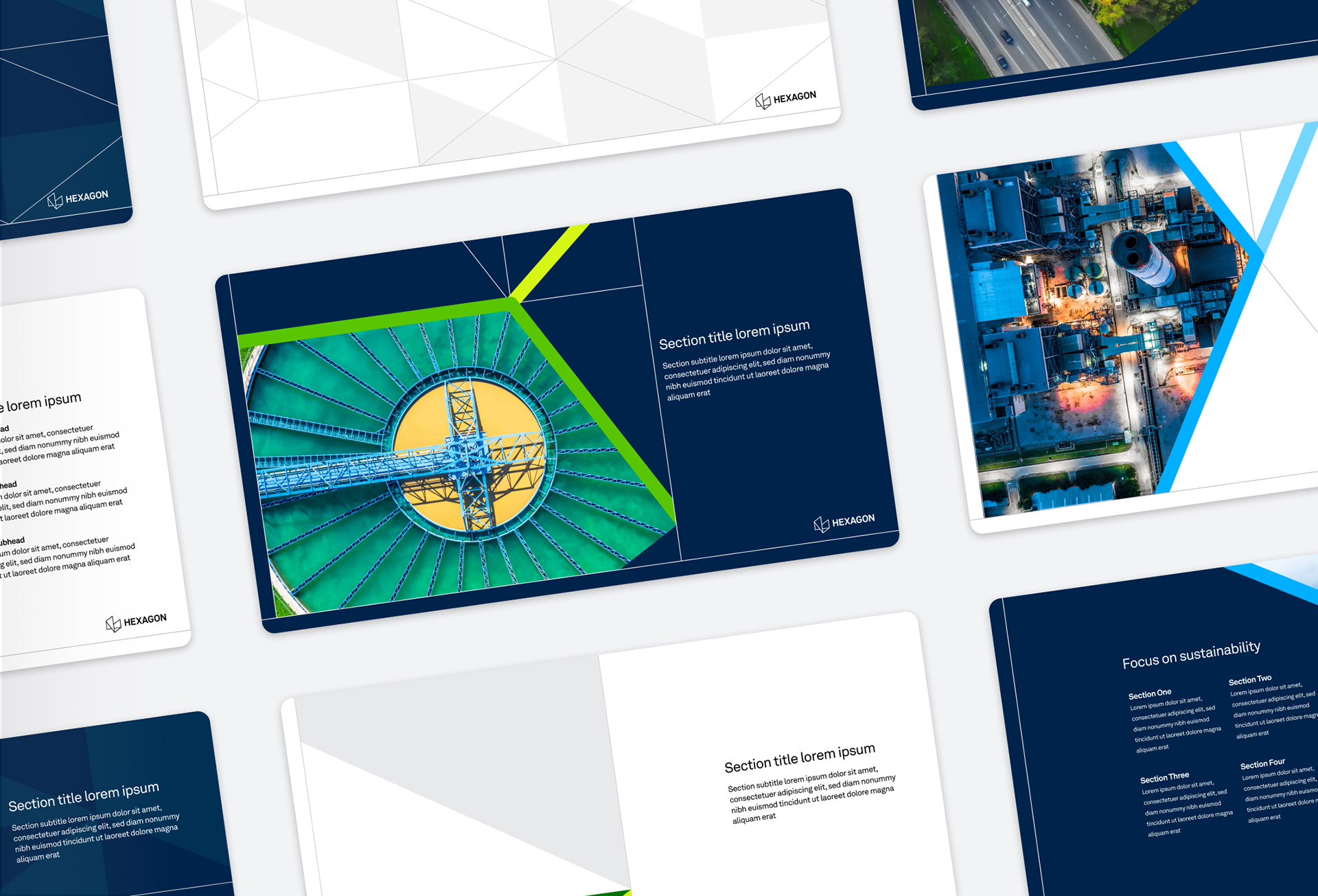
Print and digital Assets
Along with the digital assets I go to create templates for company use in the conference. This included powerpoint templates and business cards design.

Hexagon.com
The problem:
We had two main problems. First, users are having a challenging experience navigating the page and figuring out where to click. Second, the metric goals underperformed.
Restructuring the page and replacing the content with the data our users are looking for in a strategic way. We craft components that contain images and make the page more dynamic and attractive for users for more engagement.
User testing
We used Clarity a tool that gives you valuable insights into how people are interacting with your website. Through it we gathered the data from our users to see where the weak spots in the design were.
This data uncovered our users where motivated to click content
This data uncovered our users where motivated to click content
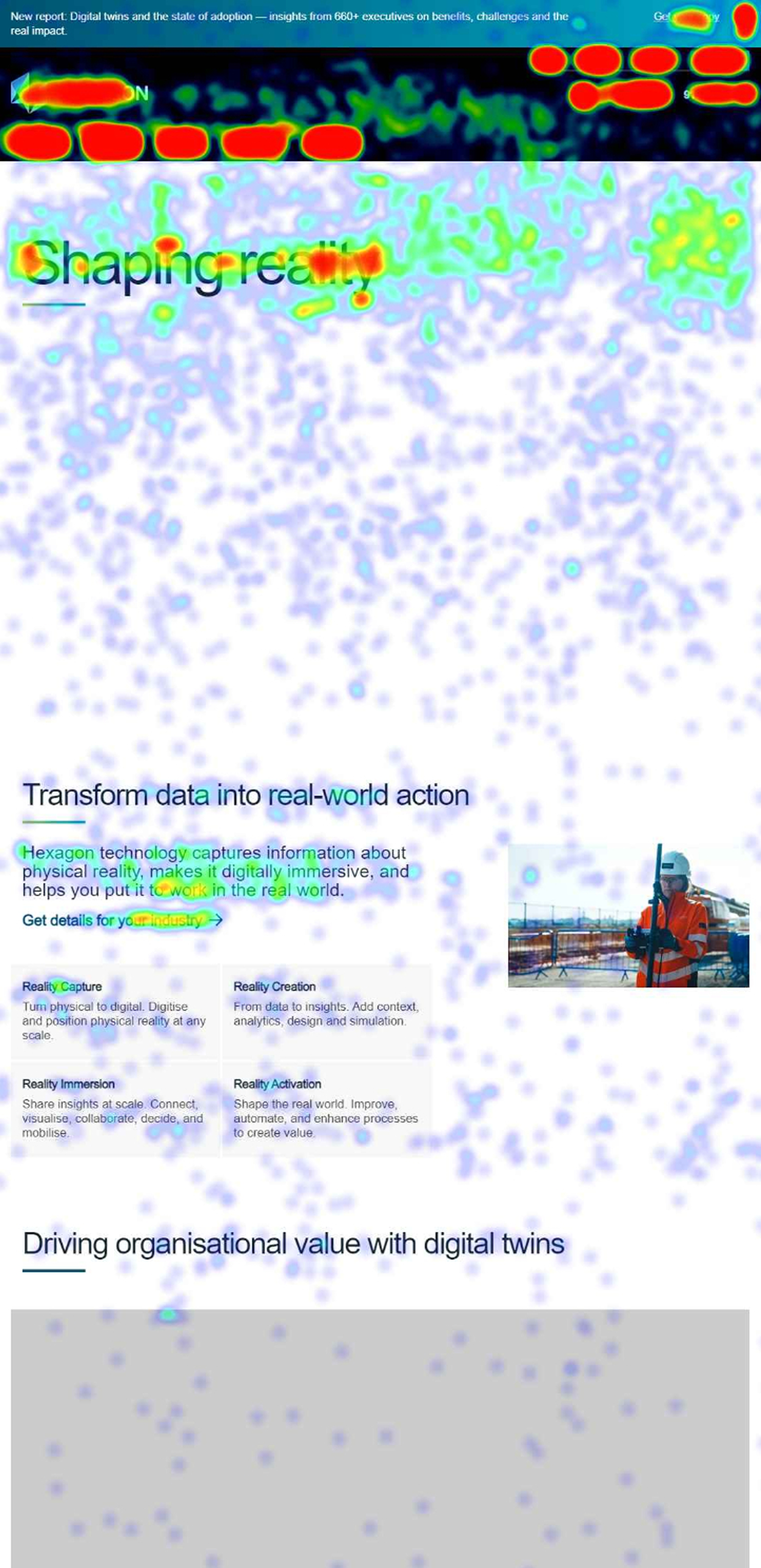

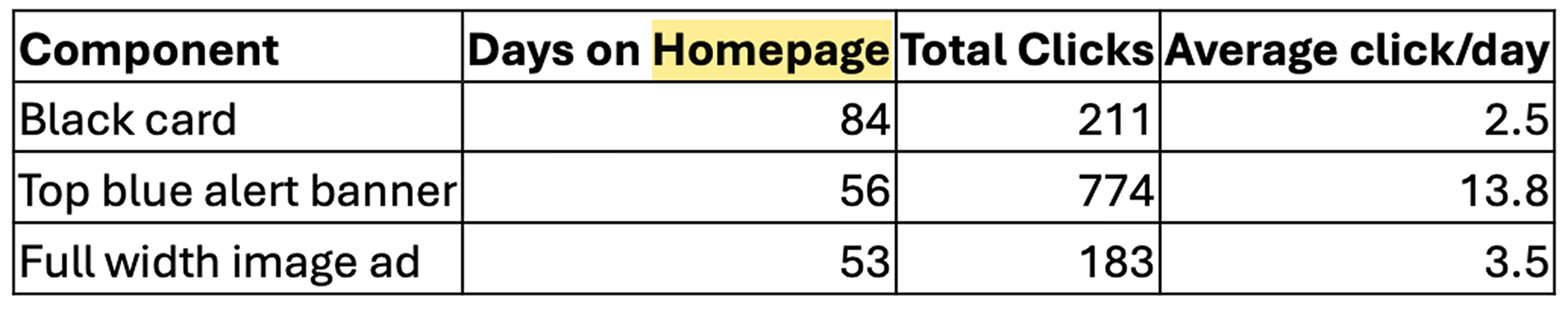
Through multiple rounds of testing, we gathered that the users were having a hard time navigating the page resulting in low click rate and engagement. We also found out they were trying to click non-interactive components of the page page which was one of the key takeaways for us.
Component design
These are some stat component design explorations.
This component was created to easily display the achievements and impressive results to our clients and instill trust in our products.
This component was created to easily display the achievements and impressive results to our clients and instill trust in our products.


Logo band
This logo band was designed with a more dynamic way to display our our clients without adding more scroll spacing to the page.

Header and Carousel band
The solution for the user not being sure where to click is creating new headers that emphasize buttons through color. Adding hovers proved to be a more effective way to lead the user to where they should click and the components they can interact with.


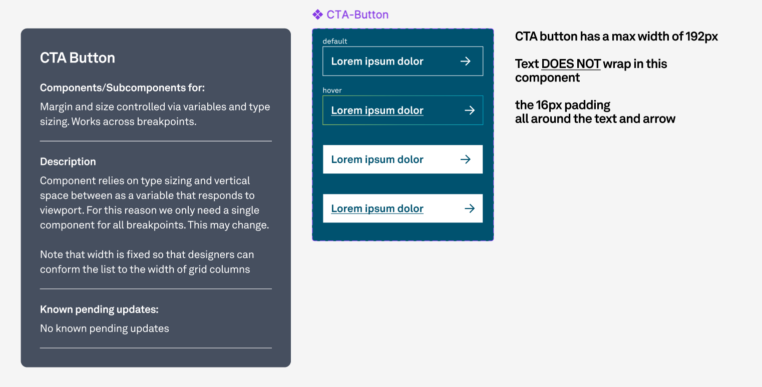
Component documentation
This process also included close collaboration with the Q&A and development team.
Providing clear documentation of the specifications for each component was key to implementing the design effectively and correctly.
Providing clear documentation of the specifications for each component was key to implementing the design effectively and correctly.

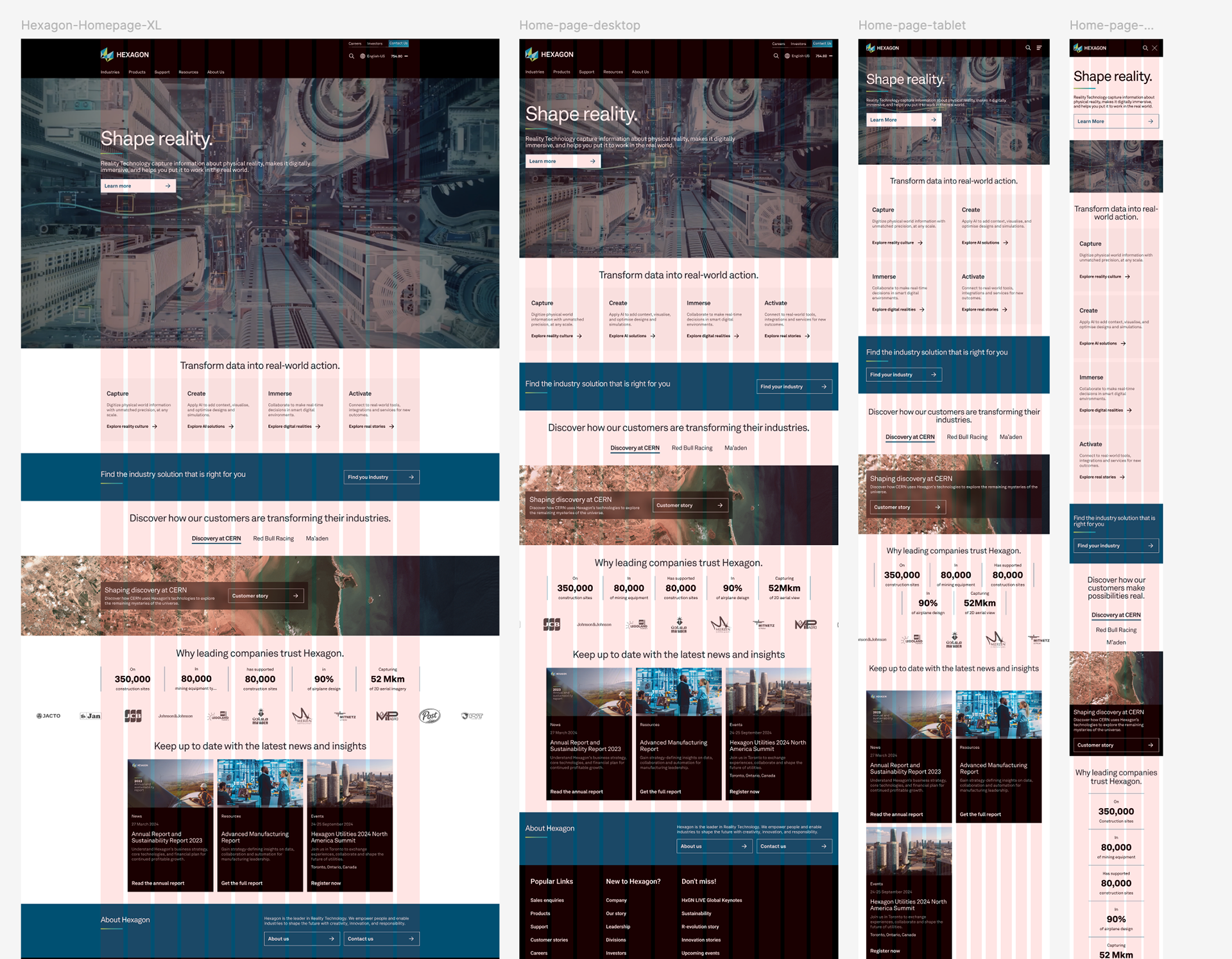
Multi-device design
When refreshing the design, we also considered the different screen sizes utilized. I used a 12-column grid throughout the devices to ensure alignment spacing was consistent in the various viewports.
Final Design
The final design can be seen live here:
https://hexagon.com/
https://hexagon.com/